import pandas as pd
url = "https://raw.githubusercontent.com/pic16b-ucla/24W/main/datasets/palmer_penguins.csv"
penguins = pd.read_csv(url)1. Load the Data Set
Before we can create visualizations for the Palmer Penguins Data set, we need to first import the data set.
Here’s the first five rows of the Palmer Penguins data set:
| studyName | Sample Number | Species | Region | Island | Stage | Individual ID | Clutch Completion | Date Egg | Culmen Length (mm) | Culmen Depth (mm) | Flipper Length (mm) | Body Mass (g) | Sex | Delta 15 N (o/oo) | Delta 13 C (o/oo) | Comments | |
|---|---|---|---|---|---|---|---|---|---|---|---|---|---|---|---|---|---|
| 0 | PAL0708 | 1 | Adelie Penguin (Pygoscelis adeliae) | Anvers | Torgersen | Adult, 1 Egg Stage | N1A1 | Yes | 11/11/07 | 39.1 | 18.7 | 181.0 | 3750.0 | MALE | NaN | NaN | Not enough blood for isotopes. |
| 1 | PAL0708 | 2 | Adelie Penguin (Pygoscelis adeliae) | Anvers | Torgersen | Adult, 1 Egg Stage | N1A2 | Yes | 11/11/07 | 39.5 | 17.4 | 186.0 | 3800.0 | FEMALE | 8.94956 | -24.69454 | NaN |
| 2 | PAL0708 | 3 | Adelie Penguin (Pygoscelis adeliae) | Anvers | Torgersen | Adult, 1 Egg Stage | N2A1 | Yes | 11/16/07 | 40.3 | 18.0 | 195.0 | 3250.0 | FEMALE | 8.36821 | -25.33302 | NaN |
| 3 | PAL0708 | 4 | Adelie Penguin (Pygoscelis adeliae) | Anvers | Torgersen | Adult, 1 Egg Stage | N2A2 | Yes | 11/16/07 | NaN | NaN | NaN | NaN | NaN | NaN | NaN | Adult not sampled. |
| 4 | PAL0708 | 5 | Adelie Penguin (Pygoscelis adeliae) | Anvers | Torgersen | Adult, 1 Egg Stage | N3A1 | Yes | 11/16/07 | 36.7 | 19.3 | 193.0 | 3450.0 | FEMALE | 8.76651 | -25.32426 | NaN |
2. Import the Seaborn Package and Create a Visualization
After importing the dataset, we can then import the seaborn package. Then, use seaborn.relplot() from the seaborn package to create a scatter plot that compares the body mass (g) to the flipper length (mm) of each penguin for each sex. Notice that there is a 3rd parameter for Sex where Sex = ".". This is because there is one entry in the Palmer Penguins data set where the sex of that penguin isn’t specified.
import seaborn as sns

fgrid = sns.relplot(x = "Body Mass (g)",
                    y = "Flipper Length (mm)",
                    hue = "Sex", # to color each point by Sex
                    data = penguins
                    )

fgrid.fig.suptitle("Body Mass (g) vs. Flipper Length (mm)") # to add title to plot
fgrid.fig.subplots_adjust(top=0.9) # to adjust placement of title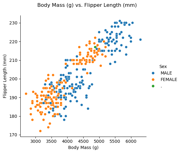
And that’s how you can create a simple scatter plot using Seaborn! You can adjust the arguments of sns.relplot() to create different scatter plots using Palmer Penguins data set.